President, BMF Investments, Inc.
September, 2010
There has been a lot of discussion lately about whether or not we are in a bull market or bear market. Is the economic ‘recovery’ for real or just a government stimulus blip? Should Representative Maxine Waters face charges of misusing her office to get her husband’s bank some of that TARP money? Personally, I think Ms. Waters is being unjustly accused. So she used her office for self-enrichment. Isn’t that what we elect Congress people to do? Aren’t they just pigs at a trough helping themselves to everything they can plunder from the suckers that vote for them? She’s an American politician for crying out loud. I expect them to be corrupt, sleazy, self-promoting, narcissistic pigs. I’m never disappointed. What’s all the fuss about? Back to my story.
I like to think of a ‘market’ as supply meeting demand. However, the modern stock market has become anything but a ‘market’. I have been writing that ‘investing’ is now confined to having positions in place when ‘The Ten Minutes’ of trading happens. What do I mean? An observer of long-term charts would not be able to see it. We have to observe the intraday trading to see ‘The Ten Minutes’. Those ten minutes are where all the action occurs. These quick bursts of activity are well coordinated (everything goes up together), well timed (everything goes up at exactly the same time), and well financed (heavy volume in a short time span implies limited buyers with a lot of money). Admittedly, I believe the PPT is behind the buying since we see this behavior whenever the Dow dips. We especially see the behavior when the Dow dips below 10,000. That level has no technical importance other than the Federal Reserve looks at it like a pervert looks at a porno centerfold.
Let’s look at five issues of concern: corporate profits, employment, income, debt, and stocks. The charts will tell us the truth. God knows nobody else will these days.
First up is corporate profits. Wall Street keeps telling us that corporate profits are back up. The first chart confirms this. However, I would like to point out the big dip and the immediate reversal to where we are today. Did the recession cause the dip? Not really. The dip in profits came from the change in the FASB (Financial Account Standards Board) rule on derivatives. In 2007, they instituted the so-called ‘market to market’ accounting that required derivative participants to account for the ‘assets’ for what they were really worth. You know, what could they actually be sold for? Turns out that ‘nothing’ was the answer and profits fell and the recession ensued. In April of 2009, the FASB relented under pressure (with a 3 -2 vote) and dropped the ‘mark to market’ in favor of a ‘mark to fantasy’ method. The new ruling allowed for derivative participants to affix a price tag on the paper to meet whatever number they needed to meet. Presto! Corporate profit growth was restored. In political terms, this is called, ‘recovery’. In real terms, this is called ‘horse crap’.

Chart 1 – Corporate profits
Second is employment. Chart 2 is civilian employment. We can clearly see that employment is declining while in Chart 1, we can see that corporate profits are increasing. If corporations can increase profits with fewer employees, why would anyone think that unemployment would ever come down? We could also extrapolate that corporate profits in the US are less dependant upon manpower and more dependant upon accounting-power.

Chart 2 – Civilian Employment
To amplify this point, we can see in Chart 3 the employment to population ratio. Very simply, there are fewer of us working. 58% of the population is now keeping up 42% of the population. At present, only 81.6% of men aged 24 – 54 have any kind of job at all. The government is trying hard to convince us that the unemployment rate is 9.5%. Yeah, sure. Granted, this chart is the ‘civilian’ population that does not include government workers. Yet, I would contend that the civilian workforce also keeps up the government workforce with our sweat and toil and taxes. Regardless, there are fewer workers in the workforce of a growing population. How long can this trend continue without real trouble?

Chart 3 – Employment to population ratio
Third, and following employment, let’s look at income. Corporate profits are up, fewer workers are working, and of course we are supposedly making more money. Intuitively, this doesn’t seem logical. Look at Chart 4. Isn’t it amazing that government numbers always eventually paint a pretty picture?
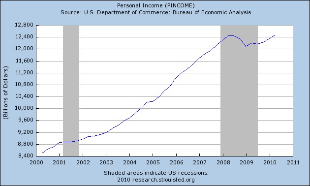
Chart 4 – Personal Income
Fourth, let’s discuss debt. Along with corporate profits matching all-time highs, Wall Street wants us to believe corporations have a lot of cash on hand. They do. And why not? There has been a lot of government stimulus for the financial sector. Accounting is now a process of corporate deception. And again, companies have shed a lot of employees. Look at Chart 5.

Chart 5 – Corporate Cash Flow
But, one thing no one wants to face is corporations also have a lot of debt. In fact, corporate debt is at an all-time high. And, this is true especially for the non-financial corporate debt situation. Look at Chart 6.

Chart 6 – Non-financial Corporate Debt
The financial institutions have supposedly been shedding their debt. Where did it go? Look at Chart 7 and then look at Chart 8. I think we can clearly see that financial institutions shifted portions of their debt from their balance sheets to the balance sheets of the Federal Reserve banks. I think the con men call this exercise the old ‘hide the bean’.

Chart 7 – Financial sector debt

Chart 8 – Federal debt held by Federal Reserve banks
Lastly, we need to look at the stock indices. What are they telling us? Let’s look at what is called a ‘rally’. They look a little suspect. Chart 9 is a 10-minute bar, intraday look at the DIA (ETF that corresponds to the Dow) for five days ending September 2, 2010. The important day was Wednesday, September 1, 2010. The Dow rallied some 254 points. There were several explanations given for the strong rally like China’s production was still growing and someone spotted a construction crew building a house somewhere in the US. In actuality, the rally, as always, came from the notion that Bernanke was standing ready with stimulator defibrillator paddles. The PPT has been running a massive intervention and manipulation program for the past several weeks. As I mentioned, each time the Dow dipped below the 10,000 mark, it was met with a forceful, high volume buy programs no doubt instigated by the Fed. But even more importantly, the 254-point rally on the day was really only about 10 minutes. The Fed goosed the futures so that the indices all gapped higher at the open of trading. Within the next 10 minutes, the Dow was up over 200 points. The rest of the day was uneventful and sideways. This is the new rally - 10 minutes of trading. What is the point that the PPT is trying to make? One, the Dow will not be allowed to fall below 10,000. Two, they want to make sure and punish the sellers and short-sellers of the indices. We just never know when 10 minutes of trading will jolt the Dow higher by 200 points. If they can keep traders from selling, the Dow will have support and maintain above 10,000. Is it a con and a scam? Of course. But it’s a good one. The trick is to be holding stocks when the PPT intervenes.

Chart 9 – DIA 5 days, 10-minute bars, intraday trading ending 9/2/10
Disclaimer: The views discussed in this article are solely the opinion of the writer and have been presented for educational purposes. They are not meant to serve as individual investment advice and should not be taken as such. This is not a solicitation to buy or sell anything. Readers should consult their registered financial representative to determine the suitability of any investment strategies undertaken or implemented.
Copyright 2010 BMF Investments, Inc.