Friday, August 26, 2011

What Does The Stock Rally Tell Us?


This week was dominated with the scheduled speech on Friday from Fed Chairman Bernanke. He was supposed to give us all guidance on the prospects of more Fed stimulus. Surely we would be given a reason to buy or sell. Of course, the stock market don’t need no stinkin’ reason to do anything. It just does.
Notice the chart below. It is an intraday look at this past week. On Tuesday, the Dow rallied 300 points supposedly because traders were convinced a QE3 announcement was imminent. On Wednesday, gold dropped $100 dollars supposedly because traders were convinced that there would not be a QE3. Again, stocks rallied. On Friday, US Q2 GDP was revised down from 1.3% to 1%. Bernanke spoke. There was no mention of QE3. The Dow dropped 200 points. With a wink of an eye and a forefinger on the nose, the Dow proceeded to rise 400 points over the next few hours. It closed up 134 points with the help, as always , of a furious buying assault in the final minutes of trade. 
What does the stock rally tell us? It tells us that we can rally because of QE3 anticipation. It can rally because there is a realization that there won’t be any QE3. It can rally because GDP was weak. It can rally because new jobless claims increased. It can rise because consumer confidence was the lowest since 1980. It can rise with new home starts the lowest on record. It can rise because Bernanke stimulates or doesn’t stimulate. It can rise because buying was greater than selling. It can rise because reality no longer matters. It can also rise because when there is no constructive use of money, it drifts towards speculation. Surely one day soon we will see a roulette wheel on the NYSE floor. Stocks could then be bought when the little ball lands on a black square and sold when the little ball lands on a red square. At least then, we would have a reason to buy or sell. 


DJIA - 8/22/11 thru 8/26/11 intraday 60-minute bars
Chart courtesy StockCharts.com
Disclaimer: The views discussed in this article are solely the opinion of the writer and have been presented for educational purposes. They are not meant to serve as individual investment advice and should not be taken as such. This is not a solicitation to buy or sell anything. Readers should consult their registered financial representative to determine the suitability of any investment strategies undertaken or implemented. BMF Investments, Inc. assumes no liability nor credit for any actions taken based on this article. Advisory services offered through BMF Investments, Inc.

Saturday, August 20, 2011

The Descending Triangle of Doom


The Dow has been trending lower since July 22, 2011. Other than a fabulous 600-point rally from 3PM to 4PM following the Fed meeting of August 9, 2011, the trend downward has been brutal and abrupt. There was also a 400-point rally two days later that was followed with two more rally days on falling volume. That may have been a warning sign. The Dow then turned lower oddly enough at just about the 38% Fibonacci retracement line of the descent. The Dow now sits at 10817. What will happen when the markets open on Monday?
Of course, no one knows for sure but there is a very interesting chart that might give us some insight. The chart below is a picture of the FXE (the euro) in gold and the USD (the dollar) in green over the past 8 years. Why should we pay such close attention to currency right now? Clearly over the last few years especially, the Dow has risen with a declining dollar and fallen with a strengthening dollar. The Dow is now lost in a current of inflation. If this relationship continues, the currency charts might be our best reference for equity trends. We must respect three messages from the chart.
One, the dollar and the euro have been undulating over the term. They grow apart. They close back together. Right now, the two lines are far apart. History would indicate the two lines must move back together. The euro must weaken and the dollar must strengthen. 
Two, notice the point labelled ‘A’. The blue line is the intersection of the FXE and the USD. For both currencies to close back together and touch, the euro needs to lose about 10% and the dollar must gain about 10%.  
Three, notice the point labelled ‘B’. The euro looks to be in a bearish formation known as a descending triangle. This could be interpreted as a bullish pennant but pennants should only extend for a period of less than 8 weeks. This formation is now more than 3 months in duration (the chart is period weekly). Descending triangles are nasty bearish patterns. When the pattern is broken below the lower horizontal line, the down trend accelerates. 


FXE in gold, USD in green - 8 years weekly ending 8/19/2011
Chart courtesy StockCharts.com
All three points taken together are strong evidence that the dollar and the euro lines are going to move back together. This should happen over the coming weeks. This is a near-term signal only as we should expect the two lines to come together and then spread apart again. Investors should be aware that a 10% appreciation in the dollar would not be a positive development for the Dow. We should also be aware that currency valuations are heavily guarded and manipulated by issuing authorities. 
If the US dollar rallies, we should expect:
  1. Stocks to fall
  2. Oil and metals to fall
  3. US Treasuries to rise
We shall see if the impending doom of a descending triangle plays out. 
Disclaimer: The views discussed in this article are solely the opinion of the writer and have been presented for educational purposes. They are not meant to serve as individual investment advice and should not be taken as such. This is not a solicitation to buy or sell anything. Readers should consult their registered financial representative to determine the suitability of any investment strategies undertaken or implemented. BMF Investments, Inc. assumes no liability nor credit for any actions taken based on this article. Advisory services offered through BMF Investments, Inc.

Saturday, August 13, 2011

Stock Market Experiences Come To Jesus Moment


Every now and then, fantasy and lies are dissolved by the truth. The truth cannot be denied. It cannot be misinterpreted. It cannot be distorted. When accepted, these points in time are known as a ‘come to Jesus’ moment. Only the truth matters. This past week, August 8, 2011 thru August 12, 2011, was a come to Jesus moment for the stock market. 
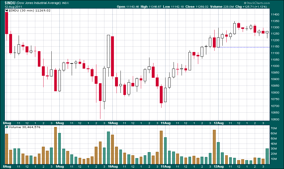
For the first time in history, the Dow experienced four consecutive days where the closing price was 400 points higher or lower than the previous closing price. The major US indices lapsed into confirmed corrections and threatened to sink into bear market levels. At the end of the week, the indices were down a bit over 1.5%. That drop masks the incredible volatility with the Dow dropping 5.5% on Monday, rising 4% on Tuesday, dropping 4.6% on Wednesday, rising 3.9% on Thursday, and rising 1.1% on Friday. Tuesday’s rise was all due to a 600-point rally in the last hour of trading orchestrated no doubt by the Plunge Protection Team. Volume was similar to the March of 2009 PPT move. Where did all this volatility come from?
Let’s embrace the truth with one example.
The current regime seems to think the US debt problem can be cured by increasing the taxes on the ‘fat cats’. The truth is the fat cats already pay most of the taxes. The debt has ballooned because of fantasy thinking, lies, and regime incompetence. Consider a few companies that the regime operates.   
Fannie Mae lost $5.1 billion in Q2 but issued $2.3 billion in dividend payments to the Treasury. How ridiculous is that?
The Post Office lost $3 billion in Q2 2011 and can’t make their $5 billion mandated pension funding payment to the Federal Employee Retirement System. 
Amtrak lost $1 billion (2010).
Aside from the $100 billion or so already ‘invested’ in Fannie and Freddie, let’s take the $5 billion in quarterly losses and multiply by four quarters. Let’s do the same for the Post Office. Now we have annualized projected losses of $32 billion plus Amtrak’s $1 billion to bring us to $33 billion total. The top 10% of income earners (about 14,000,000 taxpayers earning in excess of $113,000 AGI) pay about 70% of all taxes (IRS data). Since the US Treasury will have to write a check to these money losing government institutions, the taxpayers essentially pay for all these government subsidized loses. So, if the ‘fat cats’ have to pay for 70% of these losses, $33,000,000,000 times 70% equals $23,100,000,000. Now, $23,100,000,000 divided by 14,000,000 (‘fat cats’) equals $1,643 per ‘fat cat’. The portion of the tax bill for the ‘non-fat cats’ (126,000,000 taxpayers divided into $9,900,000,000) is $79 per taxpayer. Aren’t the fat cats paying their ‘fair share’?
‘Fat cats’ already pay other taxes that ‘skinny cats’ don’t. The stock market is the capital structure that allows publicly traded businesses to function, grow, and produce jobs. Fat cats own almost all the stock and therefore pay capital gains taxes as well as dividend taxes. Skinny cats pay neither but find employment from the effort of fat cats.
‘Fat cats’ own the real estate where the skinny cats work and rent shelter. Yes, there is some pass through but the fat cats pay the real estate taxes as well as sales taxes when they sell such properties.
‘Fat cats’ pay the employer half of the Medicare/Medicaid taxes. They pay business taxes and licenses. They pay the myriad of government regulation fees. They run all the risk of government seizure and closure for failure to comply with any of the litany of business requirements imposed by such government. The skinny cats are absolved of all such responsibility and taxation.
Again, there is some degree of pass-through as the wealthy that own the businesses simply pass on extra costs and taxes to the consumer and employees. To that argument, raising taxes on the ‘fat cats’ is really a tax increase on the skinny cats. The other argument is that the fat cats already pay a great percentage of the taxes in the US already. Many of these taxes take a form other than federal income tax. 
So the debate on how to solve the US debt addiction has finally burst into the public conscience. The previous example of taxation is one variable. But for our purposes, how has the come to Jesus moment on US debt affected the stock market? This past week reflects the realization of the truth.
Friday, 8/12/2011 - Stock indices have entered an official correction. There has been talk of recession in the air. Europe has been a basket case. Worse, the stock market has been fading. What to do, what to do? Just in time for some cheery news, the DOPE (Department of Pathological Embellishment better known as the Commerce Department) said retail sales for July had gained the most since Spring. This is one day after the Labor Department said new applications for unemployment had fallen below the 400,000 level. See - the economy is improving! It is! Really it is! The government said so! It is improving, damn it! Let’s put the crack pipe down for a moment and examine a few details.
According to even government figures, only 58% of working age Americans have a job right now. That means that 42% of working age Americans are unemployed. If even half of those unfortunate people are actually looking for work, the real unemployment number should be higher than 20%. Yes, unemployment benefits do run out over time so many people drop off the rolls each month. What really matters in any society is the ratio of productive adults to non-productive adults. The many can keep up the few but the few cannot keep up the many. We do know that in spite of this wondrous trend in falling unemployment claims, the US has rising poverty and food stamp dependent populations. Maybe the unemployment claims are falling because a good many of the unfortunately unemployed are selling crack to the government departments that compile the happy news!
Retail sales rose in July. Really? We must remember that the same government department that compiles retail sales also compiles GDP. That would be the DOPE. Remember first quarter GDP? The DOPE had to revise down the first reported 1.4% growth rate to .3%. How accurate do we really expect any of their numbers to be? We should also remember that the GDP downward revision came before the stock market buckled into a correction. Everything was fine so the DOPE could give us some bad news. Now the stock market has crashed and the DOPE is feeding us some unexpectedly good news. What a coincidence. Well, let’s look at the numbers.  
According to the retail sales report, the past three months have seen an 8.2% rise over the same period last year. Swell. However, the biggest increase came from gas stations. Yes, we all know that the price of gas is up, up, up! The extra spending on gasoline should logically have left consumers with less to spend on other stuff. But we are not dealing with logic here. The government needs a stock rally and they need some good news to feed to traders. According to DOPE, retail sales still rose even with gasoline sales stripped out. Sales of electronics and appliances rose 1.4%. However, sales at department stores and building-material suppliers fell. Again, with the crack pipe extinguished, it would seem pretty logical that electronics and appliances are sold at department stores and building-material stores. Where then, would all the sales come from in electronics and appliances if they are not purchased at departments stores and building-materials stores? 
Further, the University of Michigan/Thomson Reuters index reported that consumer sentiment had dropped in August to 54.9 - the lowest reading since 1980.  Let’s review. We have high unemployment, very low economic growth, an inept government, a current stock market correction underway, a credit downgrade by Standard & Poor’s, an economic growth expectation downgrade by the Federal Reserve, and yet the strongest consumer spending number in months. Yeah, it makes sense to me!
And yes, there is more bad news today. The Greek GDP for Q2 has come in at minus 6.9%. With the economy contracting sharply, where will Greece find the extra money to pay for their latest bailout package from the ECB? Some of their neighbors are laboring as well. Italy and Spain have descended into desperation mode as they joined France and Belgium in banning short selling of bank stocks. Selling short is selling shares that are not owned in a bet that the share price will decline at which point the buy-to-cover is made. Banning short selling just means that the regulators are trying to rig the market for gains only. It means the regulators don’t trust the ‘market’ to discover truth and reality in terms of stock prices. I always thought stock prices were supposed to reflect truth and reality?
Maybe they finally are reflecting truth. Maybe this past week was a come to Jesus moment for stocks. Maybe investors have discovered that the government does not have an economic solution that works. Maybe the Federal Reserve is clueless. Maybe the green shoots were just weeds. What’s going to happen in the coming weeks? Maybe we should look at Tuesday, August 9, 2011.
The chart below is the incredible week of August 8 -12, 2011 with 30-minute candles. On Tuesday, the Fed met and promised to keep the Fed Funds target rate at zero forever and ever. Actually I think they babbled something about mid-2013 but I think we all now understand that the idea of raising interest rates is like making plans for a midnight snack on the Titanic. That news prompted a major rally in Treasuries and a resumption of selling in stocks. The Dow was down 200 points at about 3:00 PM. That prompted a major PPT move that drove the Dow 600 points straight up in a hour! Why can‘t the Fed let investors discover stock price valuations? What are they afraid of - the truth? Stocks need to find a bottom. Will the Fed let them? 


DJIA 1 Week: 08/08/2011 - 08/12/2011 30-minute bars
Chart courtesy StockCharts.com
Disclaimer: The views discussed in this article are solely the opinion of the writer and have been presented for educational purposes. They are not meant to serve as individual investment advice and should not be taken as such. This is not a solicitation to buy or sell anything. Readers should consult their registered financial representative to determine the suitability of any investment strategies undertaken or implemented. BMF Investments, Inc. assumes no liability nor credit for any actions taken based on this article. Advisory services offered through BMF Investments, Inc.

Sunday, August 7, 2011

Stocks Correct

The first week of August, 2011, was certainly one of the wildest ever. The US markets are now in an official correction. The worst daily and weekly losses in some time come just weeks after some of the best daily and weekly gains ever. Oh, wait a minute. Those ‘best days and weeks ever’ came at the end of June. The con men that run the market now understand that monthly statements come out at the end of the month/quarter and it is easy to fool all the stupid people with a burst of buying just in time to goose the statements. Well done, gentlemen! Of course, the pronouncement of the ‘best ever’ and so on only occur in bear markets. So, those of us with any brain circuitry left can confirm that we have now entered the next phase of the bear market that never ended from 2001. 
Sure, the manipulators of markets and politics have conspired with the thirsty for gains investors to drive the indices higher. But, that drive was in the front seat of the inflation bus. Now, there are so many things working to drown the markets it is hard to know where to start.
Readers can read all about the noise of the day but come Monday, we will find out how the markets respond to the credit downgrade of the US. There will no doubt be plethoric ‘experts’ babbling about this action but here is what I think is important.
The chart I have included for this week is a 7-year chart of the Euro ETF FXE (black line) and the US dollar (USD red/black line). Very simply, the stock indexes are now another commodity driven by federal reserve intervention. Commodities are generally driven by currency valuations. As seen in the chart, the dollar and the euro have been vacillating back and forth over time. Their lines spread apart and then eventually re-connect. The chart indicates that the two lines should soon begin moving back together. That means the dollar should strengthen over the coming months while the euro weakens. If so, stocks will decline into a bearish trend. 
However, we don’t know how the currency market will react to the US credit downgrade. We also don’t know how many trillions the central banks of Europe and the US will throw at the shill banks in an effort to extend the mirage of a bull market. We don’t know what lengths these bankers are willing to implement to carry on the illusion of economic recovery so the stupid people don’t panic. No matter what, the ECB and the Fed will be very busy in the coming weeks so they could greatly disrupt reality and logic. Watch the currency charts closely going forward. 
Least we all panic and buy into the notion that interest rates will be on the rise, consider this. Derivatives and swaps are the currency of the central banker. Swaps insure the payment of interest coupons. As interest coupons rise, it makes sense that the price of swaps would also rise. The buyers of sovereign debt buy this debt knowing they can insure their investments with such swaps. Much like adjustable mortgage rates worked great as long as interest rates fell, swaps work great as long as interest rates aren’t rising. Should a bond selloff accelerate and drive up yields and future debt coupons, swaps will get prohibitively more expensive and eventually curtail the profitability of this practice. It was only a few months ago that the ECB raised interest rates in the EU to 1.5% and signaled more of the same. Some pundits suggested the same trend would manifest itself in the US. Now it seems that the ECB is perhaps even stupider than the Federal Reserve and will have to embark on reversal of policy. Central banks will have to keep buying sovereign debt for which they will trade swaps to generate the money to pay the banks to park their money at the central banks. Otherwise, the house of cards collapses. Where do the central banks get their money for this? Readers should check their pockets and wallets. Etched on the inside it says, “The Fed was here”.  Maybe the stock market already senses this?


7 years: USD in red/black, FXE in black
Chart courtesy StockCharts.com
Disclaimer: The views discussed in this article are solely the opinion of the writer and have been presented for educational purposes. They are not meant to serve as individual investment advice and should not be taken as such. This is not a solicitation to buy or sell anything. Readers should consult their registered financial representative to determine the suitability of any investment strategies undertaken or implemented. BMF Investments, Inc. assumes no liability nor credit for any actions taken based on this article. Advisory services offered through BMF Investments, Inc.

Monday, August 1, 2011

A Ferret In Our Shorts

Wouldn’t it be nice for the Dow Jones Industrial Average to act sane for a day or two? Wouldn’t it be nice for it to just open in the morning and not move more than ten or twelve points in either direction? Of course, that would require an actual ‘market’ where traders and investors decide the minute-to-minute valuation of stocks. Instead, the current indexes can routinely plummet and ascend hundreds of points in either direction seemingly for no reason at all. It’s like someone put a ferret in our shorts and shot him up with crystal meth. Who would do such a thing?
Well, the Federal Reserve has a little program known as the POMO (Permanent Open Market Operations). Here’s what it does to the markets. 
Chart 1 is an intra-day look at the Fed’s ace of deception - the Dow Jones Industrial Average (DJIA). The day is Friday, July 29,2011. To set the scene, the debt stalemate was punctuated by both combatant political parties calling the other out and demanding ‘compromise’. For those unfamiliar with political speak, that means ‘I need you to agree with my position 100%’. Also, GDP readings for the second quarter came in at 1.3% growth which was below the expected 1.6%. These numbers were from the DOPE (Department Of Pathological Embellishment - better known as the Commerce Department). To further illustrate this departments ineptitude, first quarter GDP was revised lower from 1.9% to .4%. That’s not even close enough to consider the number ‘data’. So, I think we all know that we can discount this and any other piece of data that comes from government as a lie. They always over-exaggerate economic data to the upside to fool us into thinking all is well. When is the last time they had to revise a number higher? 
Anyway, Merck announced thousands of layoffs, consumer confidence was lower, inflation was higher, and Treasury default was looming. Understandably, the Dow opened the trading day down about 150 points in the first 15 minutes. It bottomed at 12083. The PPT goes wild when the Dow dips to this area. As readers know from my last publication, Dow 12000 is the Fed Viagra line. A buy program immediately pushed the Dow up some 57 points in the next 15 minutes. The index meandered for the next 45 minutes until at exactly 10:45 AM another buy rally hit the markets pushing the Dow up 70 points in the next half hour. Actually, the Dow rose more than that and even went into positive territory (wiping out the entire 150-point morning decline) for a few minutes. What could whip the Dow index so violently in such short periods of time? How could this index drop 150 points, rise 150 points and then some by mid-morning, and then finish down 100 points on the day? How could virtually every index on the planet be down considerably at 10:30 AM and yet the Dow and her sister indexes recover to positive territory in thirty minutes? 
While the media types were all scratching there heads and looking for explanations, there is only one. Let me give readers some more of the truth. July 29, 2011 was a POMO day. Whenever there is an incredibly volatile day with an abrupt arrest of a market plunge, the Federal Reserve stands front, center, and alone. Yes, the Fed was supposed to cease and desist their market manipulation with the end of QE2 in June. Again, that was  a lie. The Fed has continued to intervene with purchases of Treasuries every couple of days injecting on average $2 billion dollars worth of manipulation. In case readers are wondering, the NYSE estimates average daily trading to be about $35 to $40 billion. The Fed is kind enough on their very own webpage (I suggest readers have a crucifix in their hand if they venture to this website) to list the days of intervention and the time of day of their activity. On this day, the Fed listed the time of intervention as between 10:15 AM and 11:00 AM. I have included this intraday chart of the DJIA with the miraculous thirty-minute rally in the blue box. 
As soon as the Fed concluded their morning manipulation, the indexes resumed their selling. We must also understand that the Fed does not buy Treasuries directly from the Treasury. They buy them from the shill banks that are dealers like JP Morgan and Citigroup with credit entries on a spreadsheet. We must ask ourselves a few questions. Why is the Fed still buying Treasuries? Why must the Fed manipulate bond markets and stock markets? When did it become the Fed’s job to instigate stock market rallies? Why are we so spineless that we cannot tolerate a true market? Yeah, I know. We don’t care how. We just want to make money. Here is a word to the wise. The next POMO days on the Fed’s schedule are August 4 and 8 from 10:15 AM to 11:00 AM. August 4 is the big day. The Fed is coming down the chimney with $3 billion that morning!


DJIA Intraday, 15-minute bars, 7/29/11
Chart courtesy StockCharts.com
Disclaimer: The views discussed in this article are solely the opinion of the writer and have been presented for educational purposes. They are not meant to serve as individual investment advice and should not be taken as such. This is not a solicitation to buy or sell anything. Readers should consult their registered financial representative to determine the suitability of any investment strategies undertaken or implemented. BMF Investments, Inc. assumes no liability nor credit for any actions taken based on this article. Advisory services offered through BMF Investments, Inc.